Tuesday, September 25, 2007

Pencil Box

First Iteration
My initial idea when I received this project was that I wanted to construct my project fully of recycled materials. The pencils I wanted to make the box for was my charcoal pencils, so i found a slick paper to line it in, so I could easily clean the box out to get the charcoal bits out. This paper went against using all materials I had found and recycled, and I wasn't too impressed by it. My biggest issue I had on this iteration was the lid. It wasn't supportive at all and it would sink into the center when you closed it. I wrote "drawing" words all over the box and words I associated drawing with. After I did it I then decided I didn't like it at all and if I wanted to continue my idea with the words I would cut out letters to spell out the words with newspaper.


Second Iteration
My second iteration I added in dividers so that each pencil would have it's own spot so they wouldn't roll around and hit each other. This would prevent a lot of charcoal residue on the paper. I decided not to cover it in the shiny paper because it wasn't very practical on quality construction. The paper I had was too thick and it went against my recycled materials. This time I constructed the box out of cardboard so it would be more structured and secure. I still had to use the matte board for the dividers because the cardboard was too thick. The layout was working a lot better for me, however the lid still was not. The shape was off and wasn't helping out the actual form of the box.


Third Iteration
This is my final iteration. I decided to line the bottom in matte board to break up the newspaper and rest the eye. I decided I need to keep it to just black and white print on the box and not pictures that had nothing to do with my box. I also changed the lid so that it would go in the direction of the strips of newspaper. This way the lid laid flat and overall was more successful rather than the "ying yang" shaped lid. I Modge Podged the lid to protect the newspaper and keep it more sealed. There were still some pieces that curled up a little. The dividers were not as successful as the second iteration and I feel like If I was more focused I would have succeeded at them better. The day I found out we needed to make our final iteration for Friday my best friend called me and told me her father has passed away that night and ever since the phone call I was a mess and was hard for me to focus. The next day in class we were allowed to work on our projects but I was only focusing on getting home to Charlotte to be with her. I know if circumstances were different I would have had a higher quality result in the end. Everyone has their off days and projects and I just have to improve for the next one.


self portrait, white on black


So it's not hideous, yet nearly nothing of what I was expecting. I think I captured the shape of my nose well. I first laid it out in graphite and then turned all the lights off to get the shadow of one light. I think the eyes got a little too big, they remind me of a puppy dog or animated fish(Nemo, particularly ha.) One thing that really bothers me now also looking back is the left eye is as white as the one on the right. In the mirror though I really felt like they were the same white, which I know realistically that isn't possible. Eh, I give myself credit though that it turned out to look like a human...well part human, part Nemo.

Wednesday, September 19, 2007

Monday, September 17, 2007

Profile Drawings


Hanna

Ben

I'm still working on getting all of the measurements and angles of the faces right but I feel like I'm becoming more comfortable the more I draw them.

Wednesday, September 12, 2007

"Cheap Sunglasses"

Boredom struck fast as I waited for Tommy to come around. I had this song stuck in my head for the past two days . My Dad and I always rock out to some ZZ Top and made me think of him as I drew it.

Staulking the Public

This assignment got awkward fast because as soon as I begun to draw the people they became aware that I was.

This one I had some issues with because there was a slight lack in people, and when they did sit down they left very fast.

This girl to the left noticed me drawing her as she was stuffing her face with pizza and once she realized it she kept looking to the side embarrassed.

Art by me, just for fun.

This is just a post for fun. I was going through my flashdrive and found some photographs of my art that I made last year in my art class. Hope you enjoy, I had a lot of fun with all of these pieces. They all are very expressionistic and have some sort of "whimsical-ness" about them.


This piece actually went up to New York for display last year because I won a gold key for a Scholastic art competition. The week I received it back in the mail I entered it into a art competition at my church and won a free trip to our beach retreat. It is four separate mono-prints with pastel and India ink on top.

EGGS!

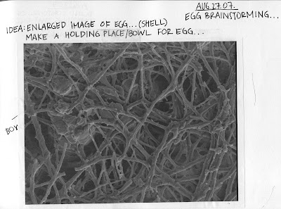
"Design a place for an egg that celebrates a part of the egg using only paper." was my assignment. I went through about four ideas before I got to this one. When I was first assigned this project I googled information about eggs and information to give me inspiration. I came across this image that I found very interesting. It was a zoomed in image of an eggshell, I thought most people have no idea that this is what the shell looks like so that is what I wanted to try and imitate/celebrate of the egg.


Final Project


Tuesday, September 11, 2007

Downtown Greensboro


So this drawing didn't last too long. "Sketchy" situations kept arising fast and I started to feel very uncomfortable. I told Lily we needed to leave fast, I didn't care that it wasn't finished after "sketchy" situation six occurred. The pencil lines kind of fill it in.


I really enjoyed drawing this one. I may have enjoyed it a little too much and captured more detailed then asked but I really loved the view I had and I sat comfortably under a tree on a bench. I was quite full too because me and Lily stopped in for a bite to eat at Natty Green's.

Friday, September 7, 2007

negative space of a bicycle


So, this was basically the hardest assignment given so far. I am amazed thought that it does somewhat look like a bike but I think the wheels look like a tomato or lemon cut in half..haha. This was a very "out of my comfort zone" assignment for me because it was so tedious and I am not used to drawing these negative spaces.

Wednesday, September 5, 2007

contour line drawings around campus


The next day I came back to the same spot to redraw it. I drew the cars this time to add more depth yet the sizes didn't decrease so therefore it really didn't benefit the drawing.

This is my second drawing of the day and I feel like the scale is better than the second one, yet its very crooked and I chose not to draw the cars which I soon realized that it helps show a sense of depth.

This is my first attempt of drawing the buildings on campus. This drawing is a view of the new science building. I think this one turned out best because the scale is right. However the last ten minutes of the drawing a FED-EX truck parked right in my view so I couldn't finish the drawing.

Monday, September 3, 2007

Negative Contours


Porch table, my favorite...


My desk chair.


My niece Kylie's chair outside.

Blind Contour of My Left Hand


A little abstracted I must say, but overall I think I did a pretty good job...