I really enjoyed doing this exercise. It was a nice break from all the research and time capsules.
 Molly
Molly I had a hard time illustrating the wire and shading it without getting too much charcoal on it. I also think that the whole at the top is just a little too dark.
 This is the time capsule I have chosen to work with in the end. The infamous cube...It was sort of hard to shade the black because I knew it was black but not as dark in areas as I first assumed.
 This definitely took me a lot longer than I expected. I fell asleep three times stippling and once decided to take a nap through it. But, I do have to say I think it looks pretty good!
 I really like the shadows on this one. I think the bottom triangle shadow that is the darkest may look just a little too dark now that I am looking at it on here. Charcoal smudging was a lot faster process than the first stippling.
 Tim posed for us on Thursday. Suzanne explained a technique she uses to get proportions right on people called "boxing off" the different shapes. I tried this technique however I feel like it made me think of the body too much so I went back to my technique of just drawing how I see it. I think this is actually probably the best figure drawing I have done.
 This week we were privlidged enough to test out and view designer chairs up in the critique room. This was my favorite, It doesn't look too comfortable but it hit my back just right. I thought it was a cute chair for a kitchen table. It was called "the moulded chair" by Charles and Ray Eames.
 I had a hard time illustrating the blanket underneath the scissors. It was very hard trying to capture the fleece texture against the metal.
 This is supposed to be a fountain in the back of Karis's yard, there were lots of plants adn shubbery so I treated it as different sections instead of each individual flower or leaf. The grass in the background I tried doing in a pattern to make it more interesting however, I'm not sure that was the right approach. It does not show the depth that I saw outside.
 This is my favorite. I feel like I really captured the correct highlights and shadows. I wish we could do more drawings in black paper with white colored pencils. I feel like I get a more dramatic result.
 This has to be the least favorite of them all. It was the assignment where it asked to pick three tones and I just do not feel like it captures what I saw at all.

 Well I never realized how much time was consumed on stippling. It is my favorite technique when it is complete, but the process is excruciating.
 This is a stool down in the lounge. I had a hard time showing the different values with just hatch marks on all the different angles of the stool so I added in some cross hatching. I didn't think we were allowed to do that but, Suzanne always says it is better to ask for forgiveness so I took the chance. = ) Overall, I enjoyed this assignment.

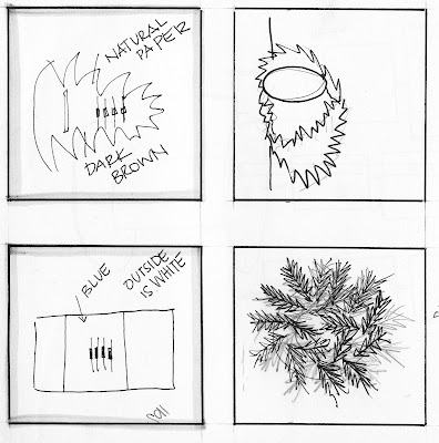
 These are the two projects I decided to work with. Stephanie's project is the feather "jungle" and Sarah's is the matchbox pencil holder.
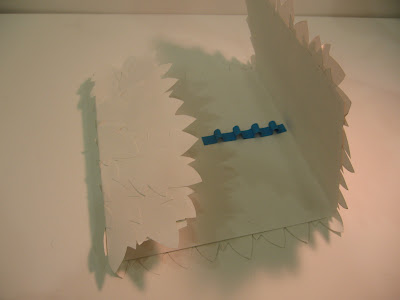
 Here is the iteration that is leaning towards Stephanie's project more. I will never look at feathers again after cutting that many out. The biggest trouble I had was trying to find a glue that didn't make the paper crinkle, and would not leave a greasy residue behind. Paper cement seemed to peel off as soon as I made the creases but in the end that is what I ended up sticking to, it was the only one that wouldn't leave the greasy residue behind.

 Here is my middle mix of Sarah's and Stephanie's. I took the concept of Sarah's pencil box and the feather form from Stephanie's.

 Here is my iteration that was more like Sarah's. I kept with the natural paper but found one that looked like it had flecks of feather's in it to mimic Stephanie's and I chose to put the turquoise feather inside as the pencil holder because in Stephanie's project the turquoise egg is hidden in the middle. I felt like it would be a more suitable place than putting a feather latch on the outside.
